Tech News
First Impressions: The iPhone 16's Camera Control Falls Short
Key Takeaways
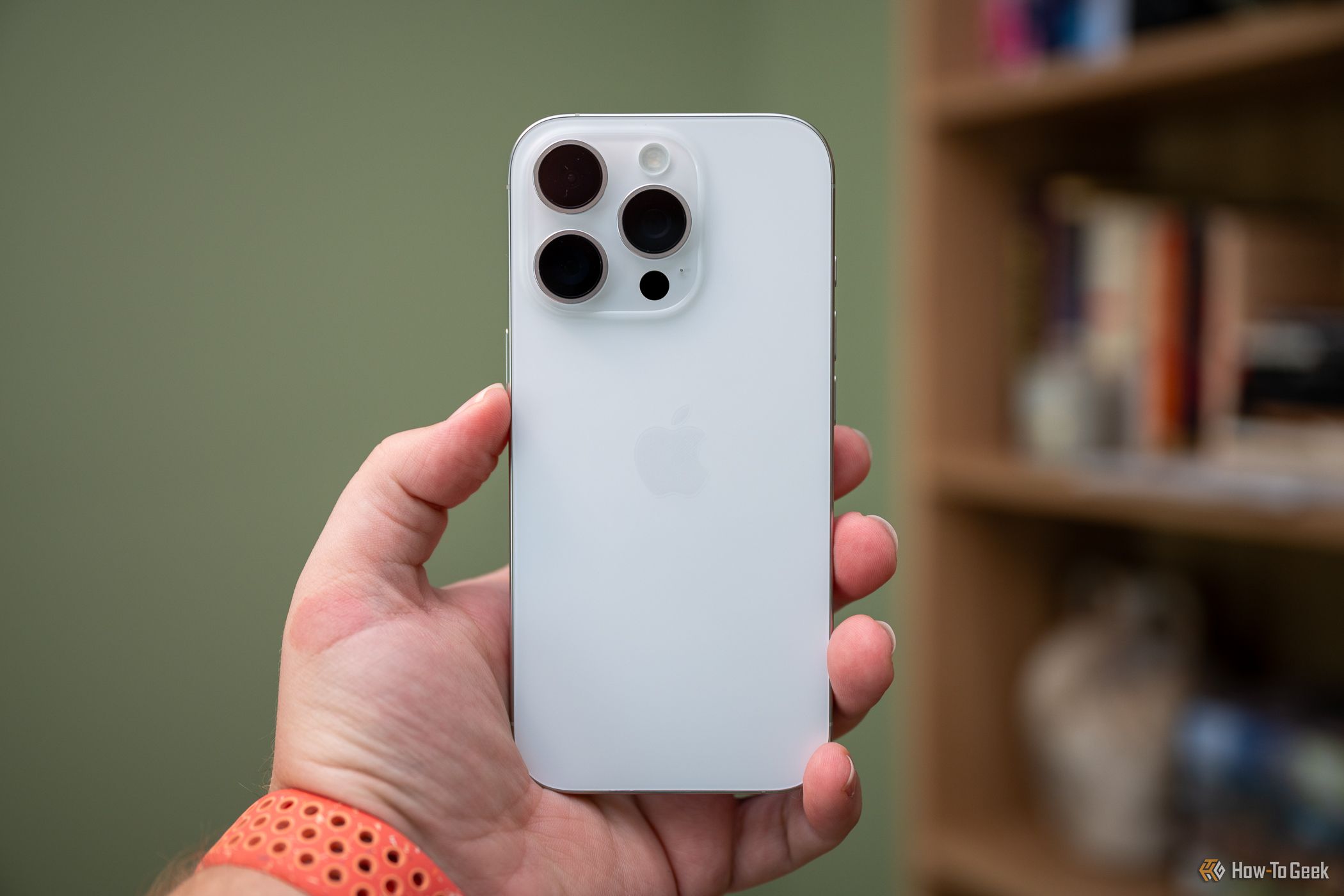
Apple added a dedicated camera button to the iPhone 16 series, but it's much more than just another reprogrammable Action button. Camera Control, as Apple calls it, is pressure-sensitive and can change settings, adjust styles, and zoom in on subjects you're photographing.
But after using the iPhone 16 Pro for about a day and handing it to others, I don't think Camera Control is going to revolutionize how people take photos with their phones.
An Awkward Placement Ruins the Fun
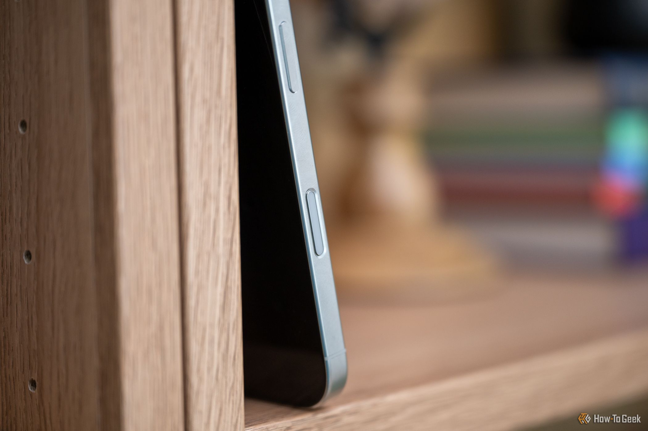
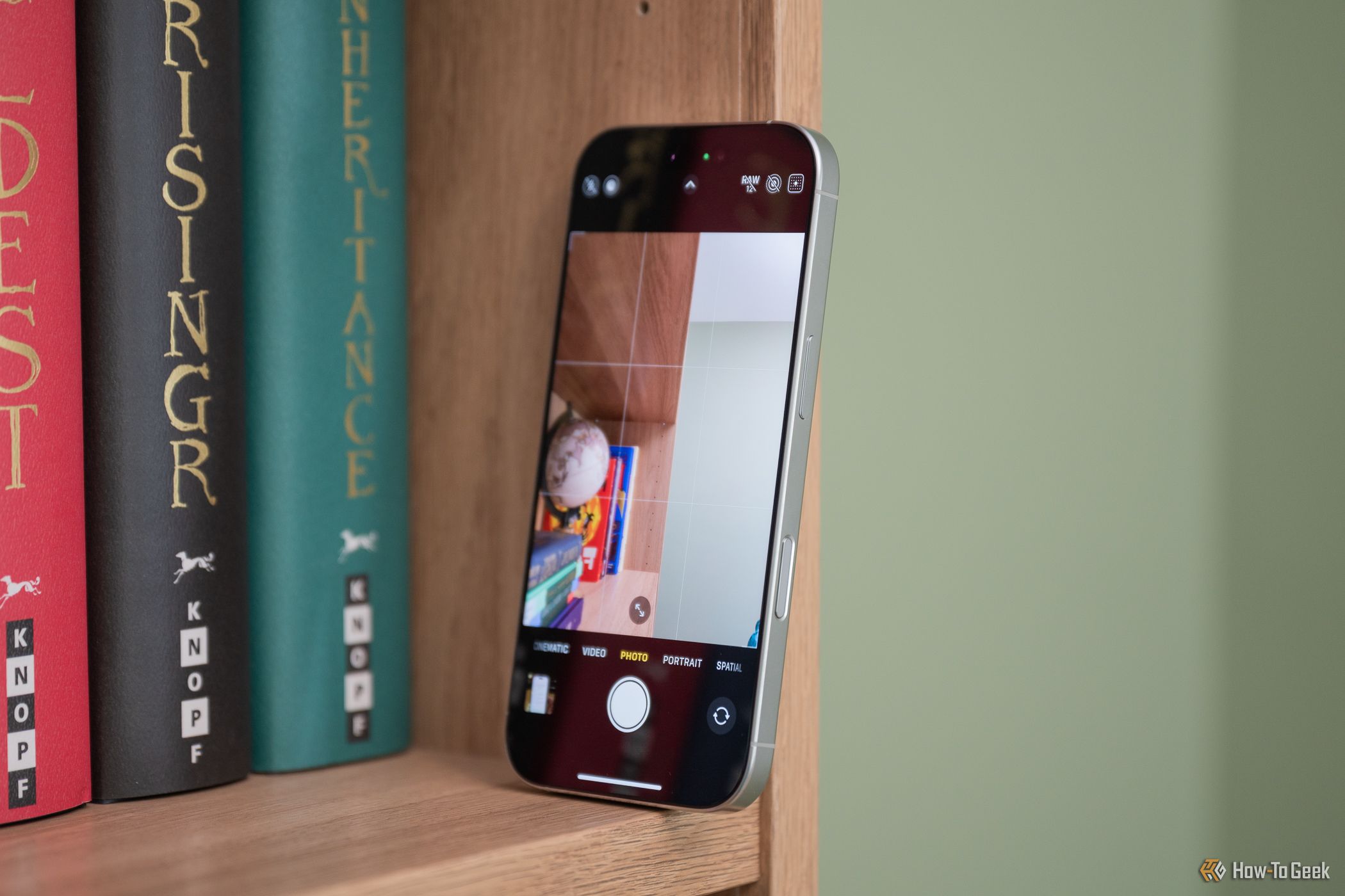
While I have doubts on Camera Control's usefulness (more on this below), I think the button's greatest weakness is its location. Camera Control is located on the bottom half of the right edge, a little under the power button. Because it's lower on the phone, whether you hold your iPhone with your right or left hand, you'll end up covering it.
Launching the Camera app with Camera Control is as easy as pressing down on the button. But when you want to use the button's pressure-sensitive features, you must be much more deliberate. This means readjusting your grip and slowing down. If you're trying to quickly capture a moment, you'd probably be better off using the on-screen controls.
Also, in a world where TikTok-style vertical video is starting to dominate, I found it funny that Camera Control was easier to use when holding my iPhone 16 Pro in landscape with two hands. I didn't have to awkwardly readjust my grip in this orientation to interact with the button. It felt much more like a traditional camera's physical shutter button.
On-Screen Controls Are Easier to Reach
Other than being slightly cumbersome to reach, the Camera Control button was incredibly inconvenient to use, as were all the half-press shortcuts.
After launching the iPhone's camera app, you have to double-squeeze Camera Control to get to the overlay. Then, from there, you have to swipe between sections, squeeze again to select an item, and swipe again to get the desired setting. That's a lot of hoops to jump through when almost all of those settings are a single tap away using the traditional interface.
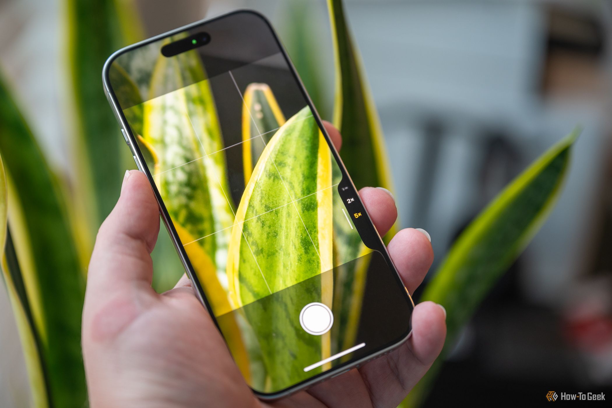
If you've used an iPhone (or really any smartphone) before upgrading to the iPhone 16 series, you already know where most settings are. Instead of switching through modes to choose a different focal length, you can just tap the 2x icon that always lives next to the shutter button. The same goes for almost every option available in Camera Control.
As a caveat, though, those who shoot video will probably greatly benefit from the button's swiping feature. After hitting record, you can move your finger across the sensor and smoothly zoom in or out on a subject. This is one area where I think using Camera Control will be easier than pinching your handset's display.
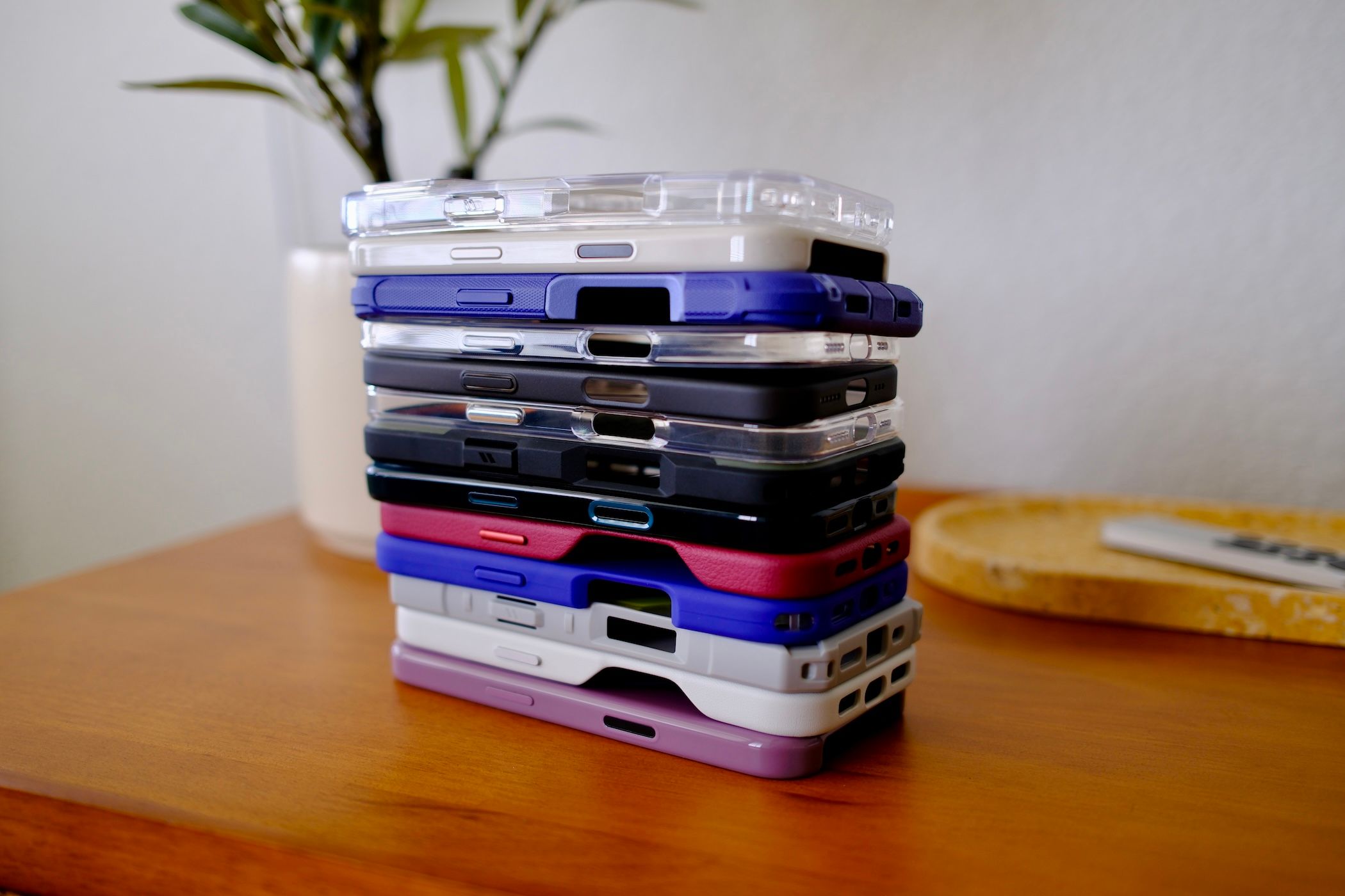
Case Makers Are Working Around the Button
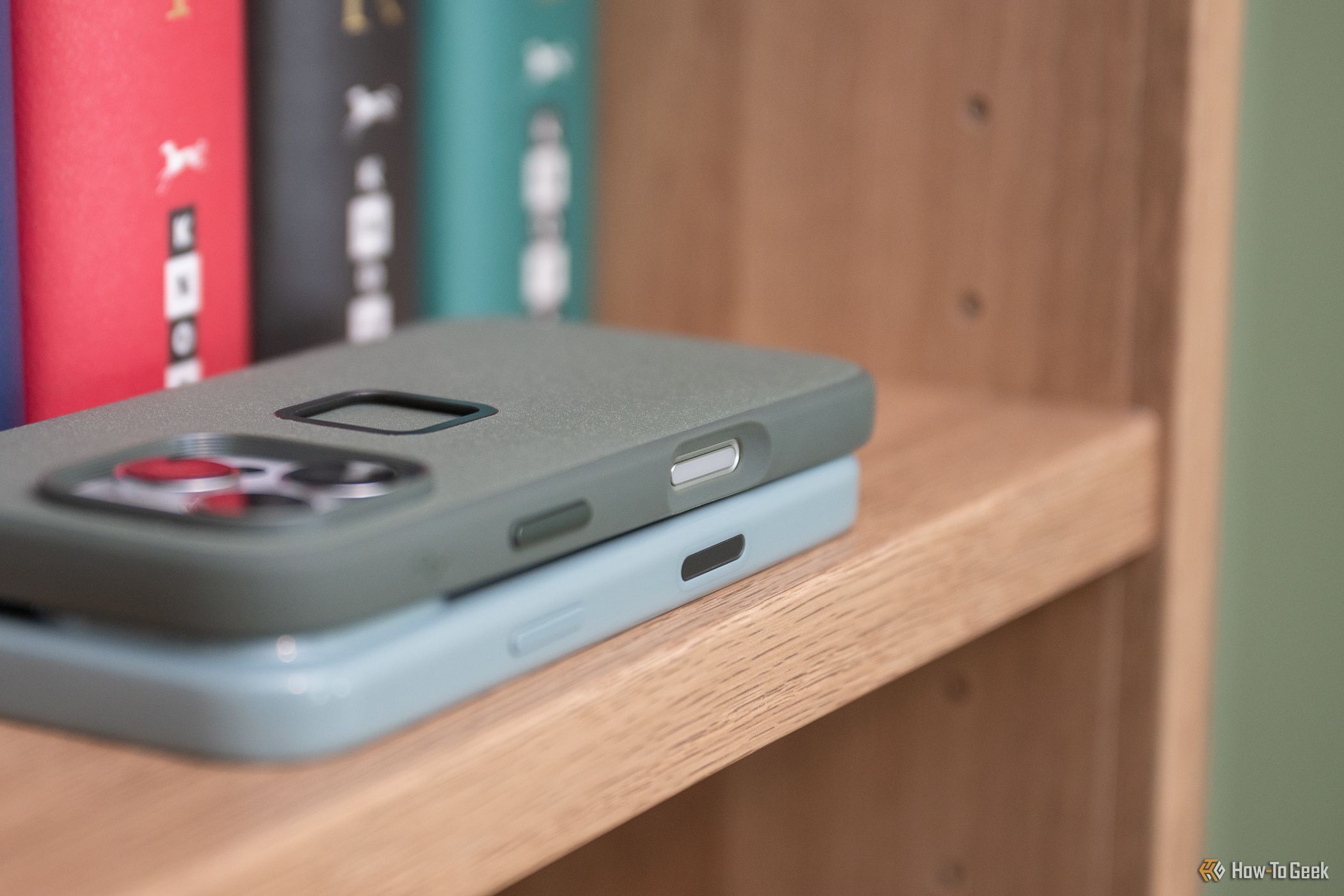
Because Camera Control is new, case manufacturers are trying to figure out the best approach to working with and around the button. I reviewed the Beats iPhone Case with MagSafe, and it uses a sapphire crystal with a conductive layer so you can interact with the button as if you weren't using a case. I would call this the "official" method as Apple's first-party cases use the same technology.
But I have two other cases, from Peak Design and Nomad, that chose different paths. The Everyday Case from Peak Design includes a cutout that simply exposes the button. Nomad's Traditional Leather Case uses a wide-open technique that leaves the entire Camera Control area open to swipe across.
While I don't think there's a one-size-fits-all or single "correct" approach, out of the gate, it's clear that everyone is trying to figure out how (or if) customers will use the Camera Control button. I'm certainly not ready to declare which solution I prefer just yet.
Don't Upgrade for the Camera Control
All of this is to say that I had high hopes for Camera Control, but after a day with the button, I think it's too complicated to be truly helpful. The button's location and sensitive controls require you to have excellent dexterity. I honestly don't think my family members with arthritis in their hands would be able to operate the delicate Camera Control options. Large on-screen touch targets are much easier to use.
I do think Camera Control as a customizable shortcut button is a great addition to the iPhone 16 series, though. It frees up the Action button, so it can be programmed to something other than the camera, and since iOS 18 lets you replace the lock screen shortcuts, you can repurpose the on-screen button to open a different app.
But do I think most people will double-squeeze the Camera Control button to switch their iPhones' camera settings after the novelty wears off? Probably not.
I will continue using and testing Camera Control while evaluating the iPhone 16 Pro over the next week, so be sure to keep an eye out for How-To Geek's full review. Maybe my opinion will change after extended use of the button.
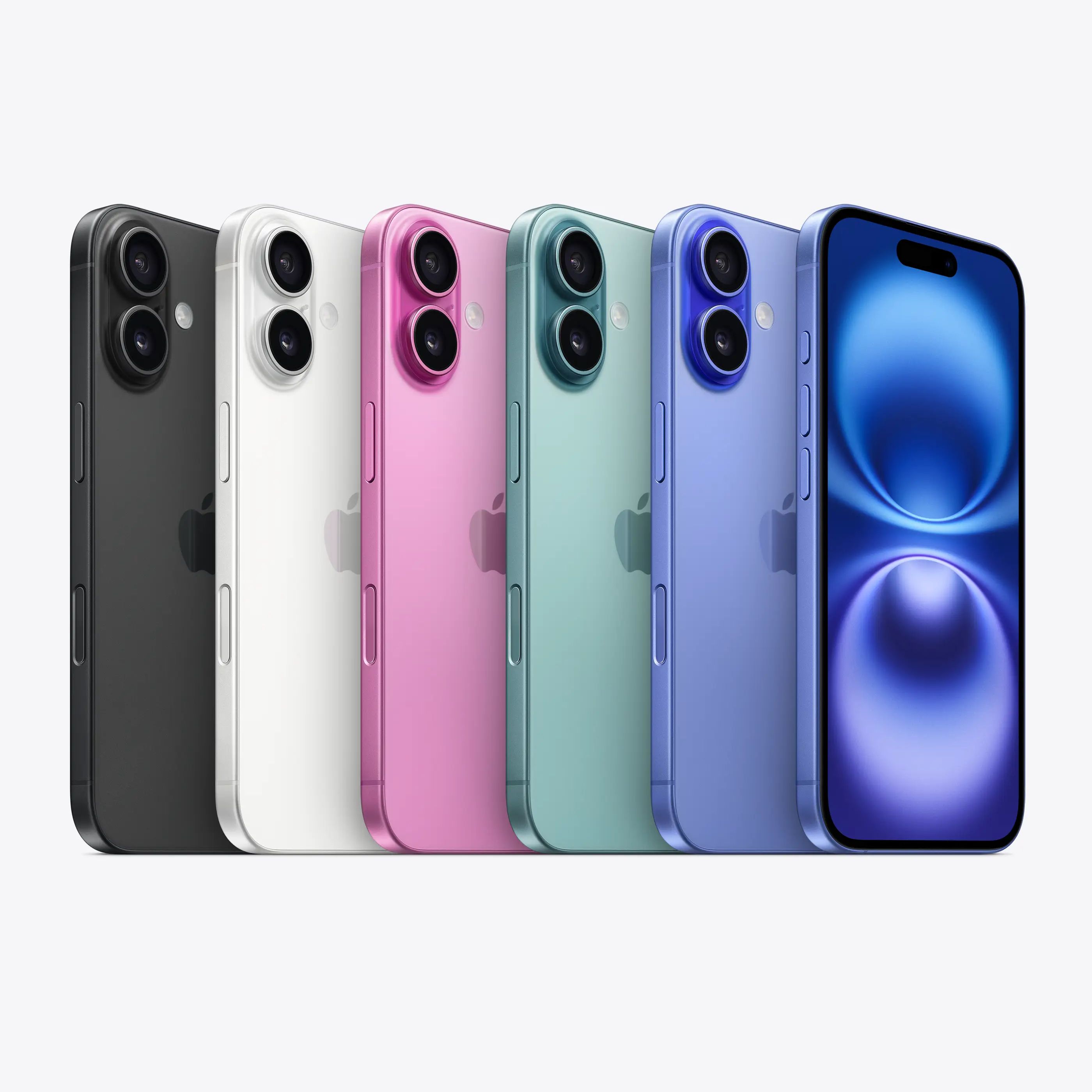
Apple iPhone 16
Apple's newest iPhone featuring a camera button, programmable action button, and artificial intelligence features.
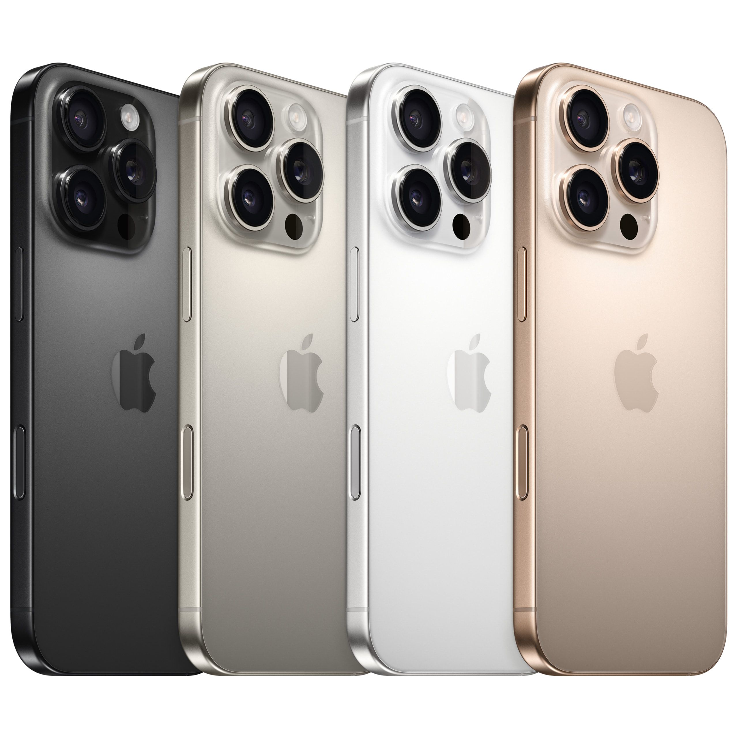
Apple iPhone 16 Pro
A version of Apple's newest iPhone with a larger screen featuring a camera button, a programmable action button, and artificial intelligence features.
When you subscribe to the blog, we will send you an e-mail when there are new updates on the site so you wouldn't miss them.


 Justin
Duino
/
How-To
Geek
 Justin
Duino
/
How-To
Geek
 Justin
Duino
/
How-To
Geek
 Justin
Duino
/
How-To
Geek
 Tyler
Hayes
/
How-To
Geek
 Justin
Duino
/
How-To
Geek
Comments