Tech News
Call Me Crazy, but I Miss the MacBook Touch Bar
Key Takeaways
I know you're already thinking “yeah, this guy truly is crazy,” and I completely understand. MacBook Pro Touch Bars broke often and lacked function. But I still have a soft spot in my heart for Apple’s only attempt at bringing touchscreen technology to their laptops.
And no, it’s not only because you could put Nyan Cat on it.
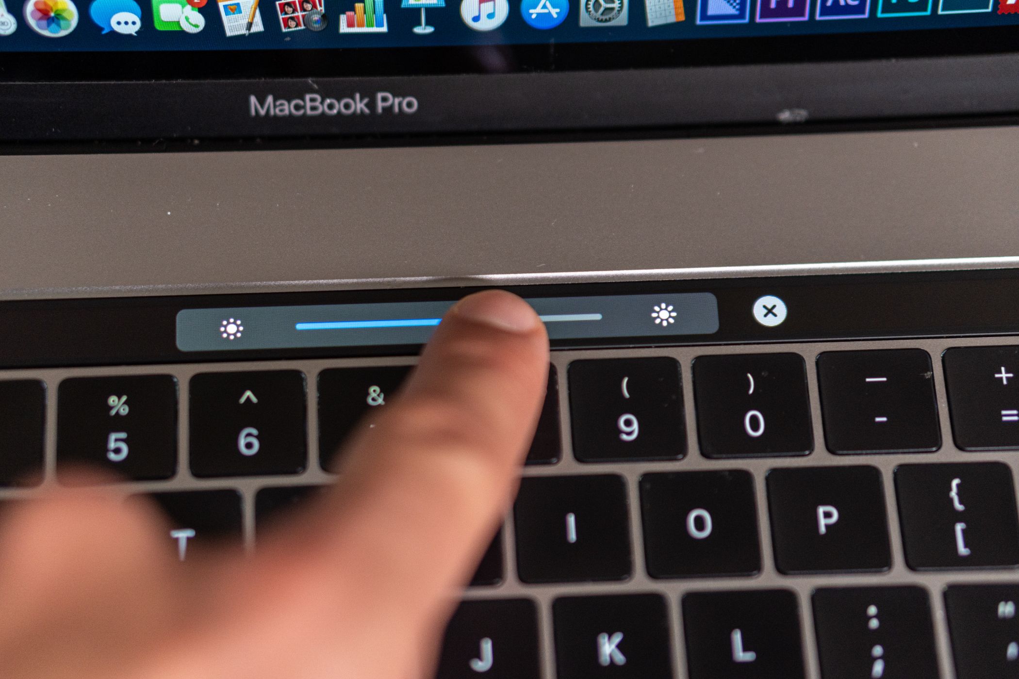
I Prefer Volume and Brightness Sliders
Sliders and dials are perfect for fine-tuning settings. In the case of the MacBook Pro’s Touch Bar, they allowed for a smooth transition between volume levels and screen brightness as you scrubbed until the settings were just right.
Pressing function keys to achieve these tasks, as we’ve traditionally done, works fine. But the sharp volume and brightness jolts that occur aren’t aesthetically or audibly pleasing to me. Plus, all the tapping is inefficient when you think about it. Sliding a finger along the Touch Bar required less physical work while offering better control.
You can test this difference for yourself by opening the Control Center in your Mac’s menu bar (it’s the icon with two sliders on it). Here, drag the volume and brightness sliders back and forth a bit. Quite a bit more pleasant, wouldn’t you say?
The Touch Bar was also great for video and audio playback in a similar capacity. Being able to scrub through YouTube videos with the tip of my finger made searching for the exact moment I wanted to watch a smoother, more tactile experience.
Did you know that you could even skip ads by scrubbing through them? It’s a nifty trick, even in an era of ad-blocking ubiquity.
Switching Between Tabs Was Never Easier
If your workflow is like mine in that it involves a plethora of open tabs, you know it’s easy to find yourself frantically clicking through them in order to arrive at the one you’re looking for. Tabs on the Touch Bar did away with this mess to an extent, giving you a sneak peek at each page.
I won’t front as if this feature was brilliantly implemented since the Touch Bar was too small to discern the finer details of a site. Hovering a Safari tab with your mouse provides a far better read of its contents. However, having it all laid out in a tappable row still provided an extra layer of easy access to the web browsing experience that came in handy at times when I could easily identify what I was looking for.
It also should be said that adding a new tab by way of the Touch Bar became part of my keyboard motor function, though Command+T also gets the job done.
Having bookmarks on the Touch Bar provided ease of access to websites I frequented. It was fun to see all the favicons lined up for my tapping pleasure and was a superior option to the bookmark bar that I've never found wholly intuitive.
Some Apps Put It to Great Use
Given its short-lived time on the market, bespoke support for the Touch Bar was limited. However, some of the ideas released during that time frame put it to great use.
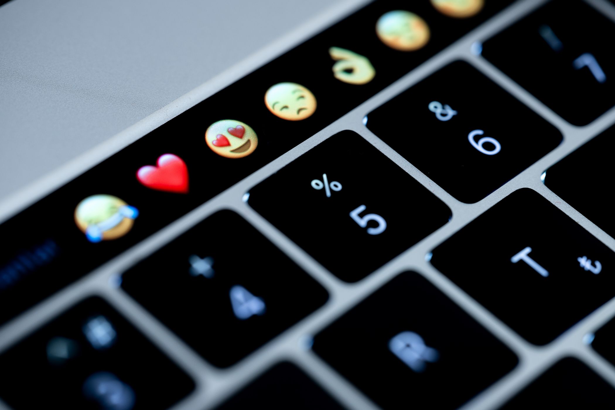
There were apps that let you convert the Touch Bar into your Mac’s dock or scroll through emojis (something that may not have been practical but sure looked cool). PDF Expert—my PDF viewer of choice—put much of its menu bar and sidebar tools onto the strip, which I found particularly useful for common use cases like swapping between highlight colors. This saved me the trouble of clicking around the UI, making for a more fluid reading experience. Similar functionality was made available in other word processors, editing apps, and the like.
My favorite use of the Touch Bar was far more novel than any of those, though. djay Pro impressively lets you scratch tracks, add audio effects, swap decks, and more via the strip. Sliding my finger to modulate music was simply good fun and gave me functionality that wasn’t replicable on my budget DJ controller.
Granted, using the feature for too long made my Touch Bar become hot to the touch, though I imagine it was pushing the tech in ways Apple never intended.
It Felt Like the Future
Some wheels don’t need reinventing, which is why keyboards have largely stayed the same for decades. Apple dared to innovate on a tried-and-true design, a choice that was perhaps folly by way of hubris given the company's track record for changing industry standards. But the Touch Bar felt like a taste of the future because it tried something new.
Screen technologies have that effect given that entertainment media, advertising, and so forth have correlated them to visions of tomorrow. Screens can transform to fit any need, which in turn means endless possibilities. It’s why the iPhone is and likely will remain the most important technological leap this century; it’s an everything device.
By this same measure, the Touch Bar had me reconsidering just what a keyboard could be capable of. Maybe this would’ve played out differently in a world where the technology wasn’t riddled with issues that resulted in a keyboard people couldn’t rely on despite its costly $500 price tag (one forced upon 15-inch MacBook Pro owners).
Apple Needs to Be More Apple
So, perhaps it’s best said that I want the innovative spirit of the Touch Bar to live on. I want Apple to continue taking risks by shaking up the technologies and designs we’ve taken for granted. The company’s most historical moments hinged on this, dating back to popularizing the use of a mouse and GUI in computers.
While the company does still attempt to introduce game-changing products, they now come in the form of gadgets for enthusiasts with cash to burn, like the infamously expensive Apple Vision Pro. Its main product lines are purely iterative now, something I can’t help but wonder whether the failure of the Touch Bar impacted.
Not only that but given my fondness for it, losing the Touch Bar when upgrading to an M2 MacBook Pro felt like taking a small step back. Don’t get me wrong, I love the raw power of this laptop, and I’ve adjusted back to the old normal. Yet it still feels like Apple played things safe to a fault by completely eradicating their horizontal touch screen. It screams to me as a company with an identity crisis in a world where the influence of the Steve Jobs era is now very much in the rearview mirror.
And that’s the real takeaway here. The Touch Bar admirably represented Apple's gumption to find the next big thing, and it would be remiss not to continue to similarly try out concepts that rock our boats. They’re in a unique market position to push boundaries, which means when they move that goalpost back, it has a chilling effect.
And as I noted, that Touch Bar could get really hot!
When you subscribe to the blog, we will send you an e-mail when there are new updates on the site so you wouldn't miss them.


 Tim
Brookes
/
How-To
Geek

Comments