Tech News
Both Spotify and Apple Music are Sorely Missing This Essential Feature
Quick Links
Key Takeaways
Playlists have long been the dominant way through which people consume music on streaming platforms. It’s therefore surprising that both Spotify and Apple Music haven’t figured out intuitive ways for users to create them, even though iTunes laid the groundwork for a playlist editor over a decade ago.
Welcome to the Playlist Era
The way we’ve engaged with music has always been shaped by the form factors available to us. Cassettes, vinyl records, and CDs lend themselves to experiencing complete albums as they’re most easily played in a linear fashion, while digital platforms allow listeners to cherry-pick their songs of choice and organize their favorites in playlists.
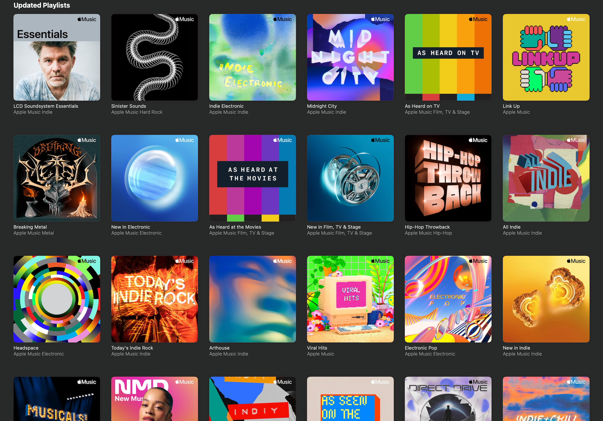
Now, streaming services have ushered in an era where people let each platform’s curators (human or otherwise) dictate their daily soundtrack through pre-built thematic playlists. There’s a reason why many artists’ most streamed songs are those that found their way onto one of these. Playlists (alongside music-based social networks like TikTok) have undeniably become how people discover new bands or what songs people hear from bands when individually searching for them.
Outside of music discovery, it’s easy to find a premade playlist that matches the vibe you’re looking to capture and let it passively set the mood. It’s a listening experience that stands in stark contrast to the active listening required to appreciate an artist-crafted album, but the tradeoffs aren’t without merit. In fact, a wider variety of consumer desires are being filled than ever before.
Self-created playlists still have their place in this modern age, too. Streaming platforms have turned sharing and collaborating on playlists into a social pastime not far removed from handing out burnt CDs to your friends in the 2000s. However, the process of making them has remained a shockingly unfriendly user experience for computer users.
Making Playlists Is a Paradoxical Pain
Given how vital playlists have been to the digital music landscape since their inception, it’s surprising that both Apple and Spotify have failed to innovate in the process of creating them.
If you’ve ever created a playlist (and I’d wager you have), you’re well aware of the painstaking exercise that is seeking out every track you want to include and dragging it to the navigation bar or wading through right-click context menus. User errors such as dropping songs into the wrong playlist are all too easy to make and slow down the process.
Want to look at the playlist you’re building? Be prepared for the tedium of toggling between your library and the playlist. If you’re using Apple Music, you can open the playlist in its own window and place it next to the app, but this scrunches the interface to a portrait-esque shape that some UI elements don’t adapt well to. It’s uncharacteristic for Apple to champion clunky and unintuitive workarounds like this, yet it’s the solution often offered to those looking for a better way to edit playlists. The most puzzling part about this is that Apple already devised a fantastic solution in the later years of iTunes only to remove that functionality in the transfer to Apple Music.
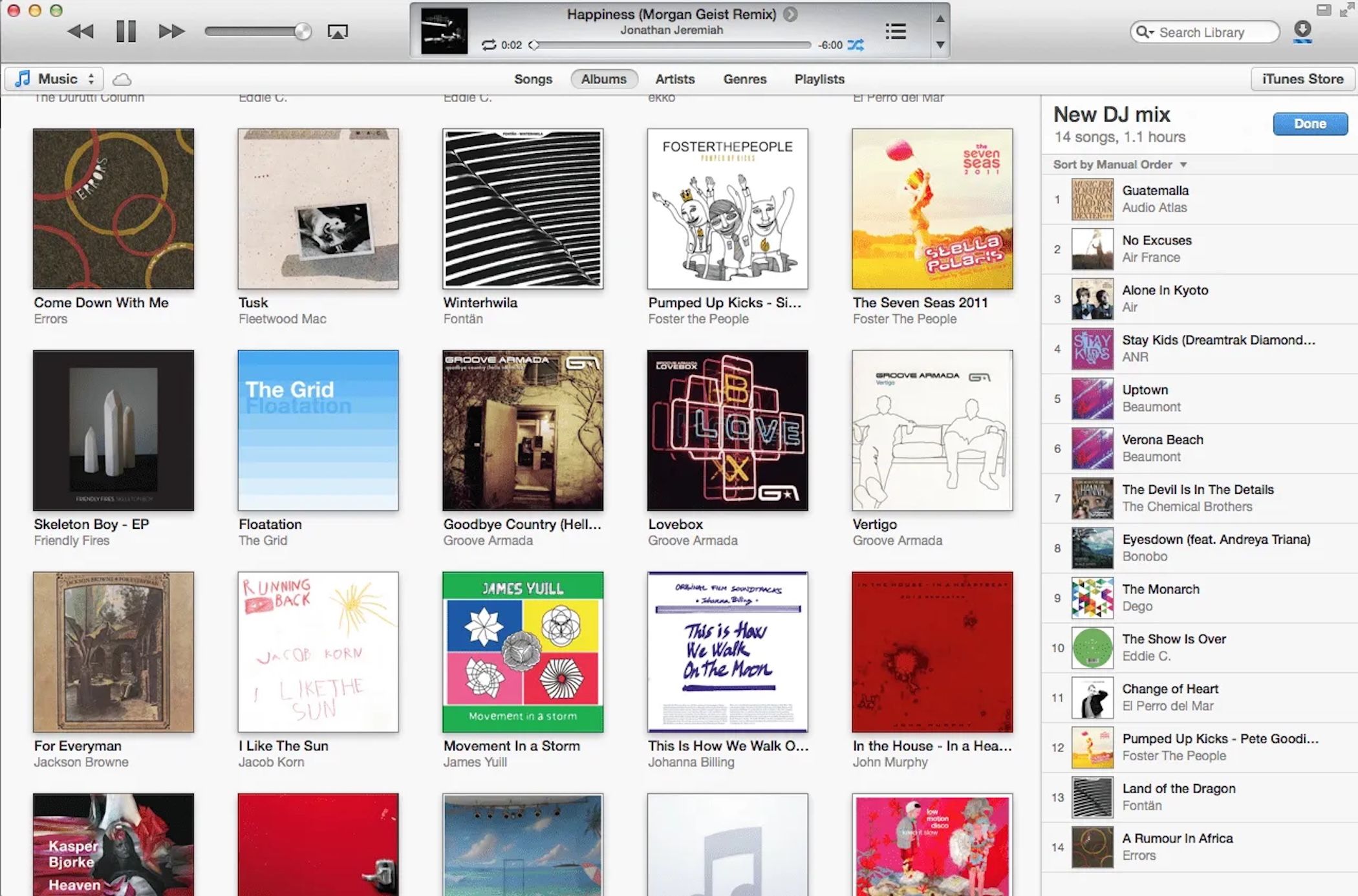
Prior to its Apple Music makeover, iTunes had a playlist editing feature that placed the playlist in a sidebar on the right-hand side of the screen. It remained there as you searched your library for tracks to add and dragged them directly into the editor, exactly where you wanted them sequentially. It cut out the frustration of navigating menus and swapping between windows and replaced it with a solution that was elegant and easy to understand.
It was a huge letdown when Apple removed this feature, both because of its usefulness and how its demise was met with little fanfare beyond disgruntled Apple Support Community forum posters (who were promptly told to use side-by-side windows instead). I’ve hoped for its return with every macOS update to no avail. Instead, we’ve received features that provide parity with Spotify, such as collaboration, suggested songs, and custom covers. Yet they’ve never again allowed the right-hand sidebar to regain its function as a playlist editor.
What Does the Future of Playlist Creation Look Like?
Ideally, the future of playlist creation would look a lot like the past described above. It’s anyone’s guess whether Apple will bring this feature back and if Spotify will follow suit in introducing it. After all, there’s no logic I can conjure for its removal, especially as the company pushed a categorically worse alternative in its wake.
It’s been the better part of a decade since the editor’s demise, though, so I would wager Apple’s UI designers have moved on. They’ve already opted to omit it from updates to playlist functionality, which means it’s clearly not a priority (if it’s on their radar at all). Plus, Apple Music sees marquee revisions less often than many other Apple apps, which only digs the editor’s grave deeper.
The reason it’s likely not a priority or even a desire for Apple or Spotify is that both companies would rather push their own curated streaming playlists. This retains subscribers who value this service and makes sure the music being streamed is exclusively from the platform’s library, not locally stored files they don’t reap the benefits from. It’s for this reason that the word “playlist” has become synonymous with the groupings of songs put together by the platforms.
It's also likely that AI will become a part of the playlist ecosystem. While Apple Music isn’t part of Apple’s currently announced Apple Intelligence plans, chances are this changes in the future. One can only assume that expressing the style of music, you’re looking to hear and having AI do the heavy lifting will only further pull people away from creating bespoke playlists. Even I can admit that the temptation of saying, “Recreate the setlist I saw from the concert I saw last night using setlist.fm” and having it appear before my eyes in playlist form is a tantalizing prospect.
However, I still feel that creating playlists of your own is a valuable experience. There’s a unique gratification to playing conductor to the symphony of your favorite tunes, choosing the most fitting ones and tweaking their placement until you find a perfect sonic ebb and flow. The personal touch this brings to interacting with your music library simply can’t be replicated by generalized and generated playlists. This is why streaming should still strive to innovate in this space, or at least copy the iTunes of yore’s homework.
When you subscribe to the blog, we will send you an e-mail when there are new updates on the site so you wouldn't miss them.


 Tim
Rattray
/
How-To
Geek
 Phil
Morse
/
Digital
DJ
Tips
 Apple
Apple
Comments